Brand Identity · Creative Direction

A playful identity for a baby retail business.

Tarwano Baby Store's identity combines warmth, playfulness and recognizable brand elements: expressive lettering, a soft colour palette and illustrated details inspired by stars, planets and the night sky.

The system extends across packaging, printed materials and digital communication.

ClientTarwano Baby Store
SectorBaby retail
ScopeIdentity · Creative direction
DeliverableBrand guidelines
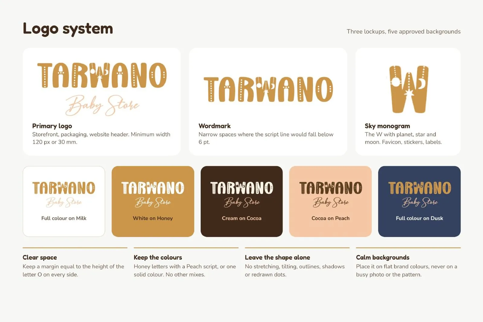
Tarwano logo system: primary logo, wordmark, sky monogram and approved backgrounds
Logo system: three lockups, five approved backgrounds
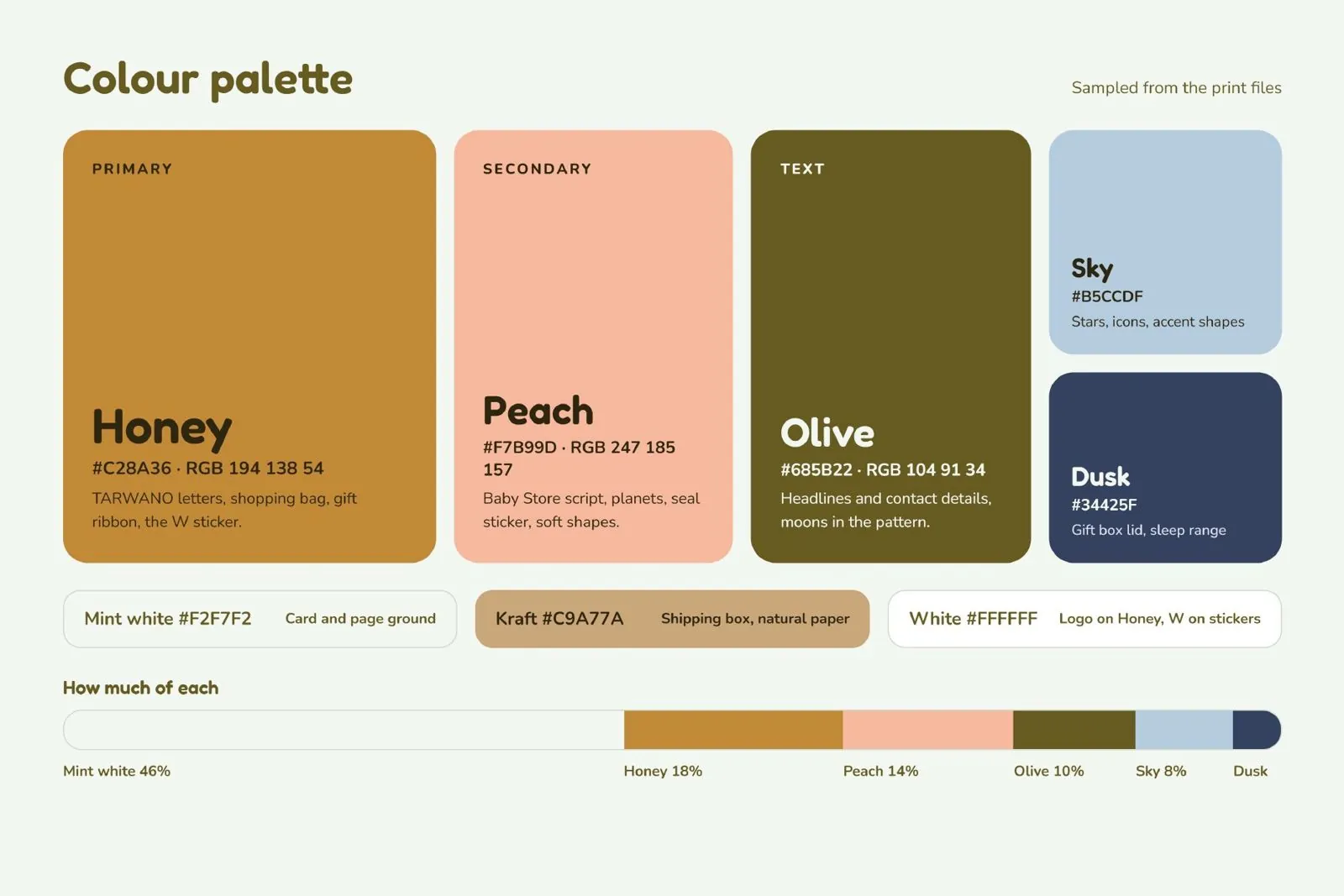
Colour palette: Honey, Peach, Olive, Sky and Dusk
Colour system
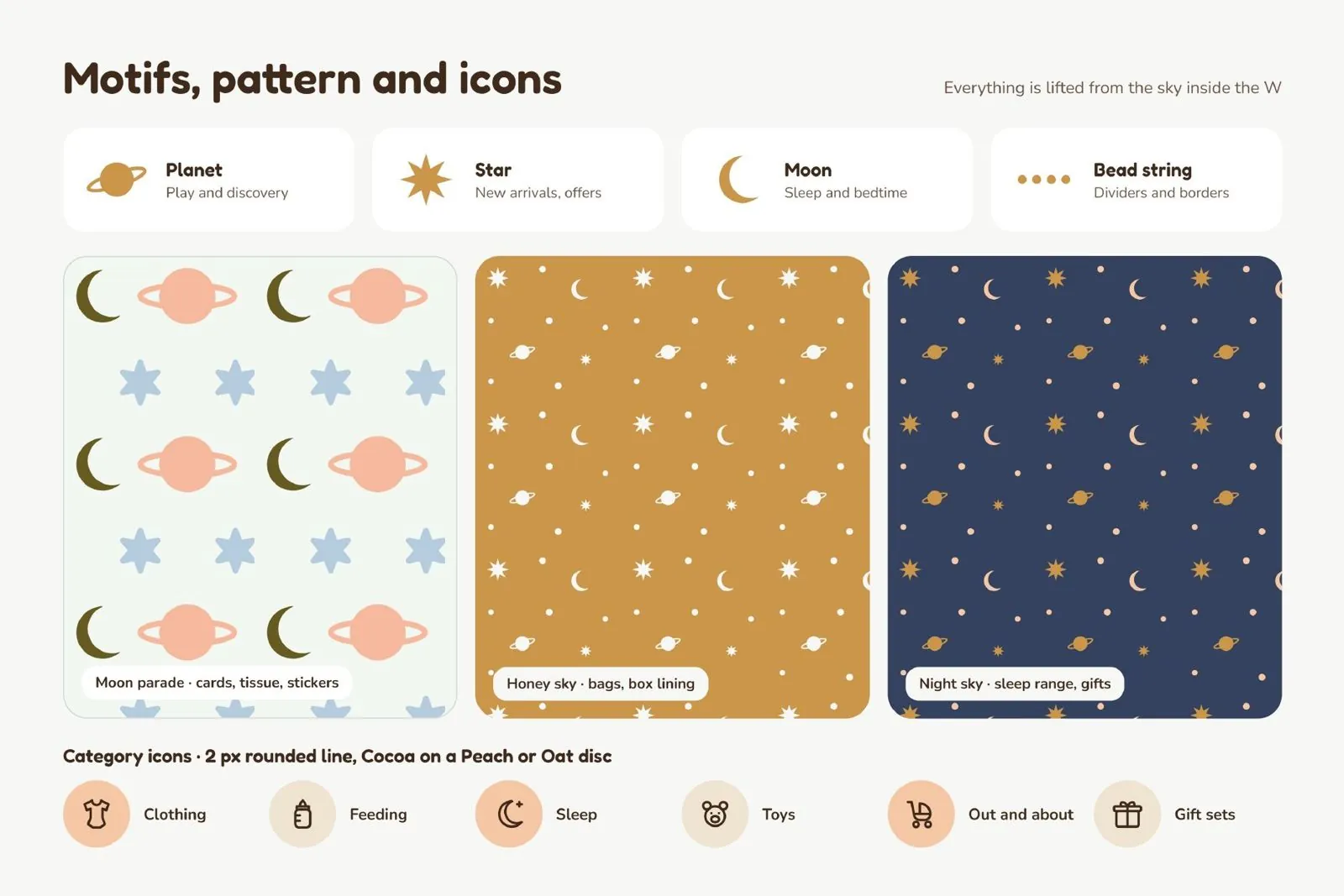
Motifs and patterns: planet, star, moon and bead string
Motifs, patterns and icons
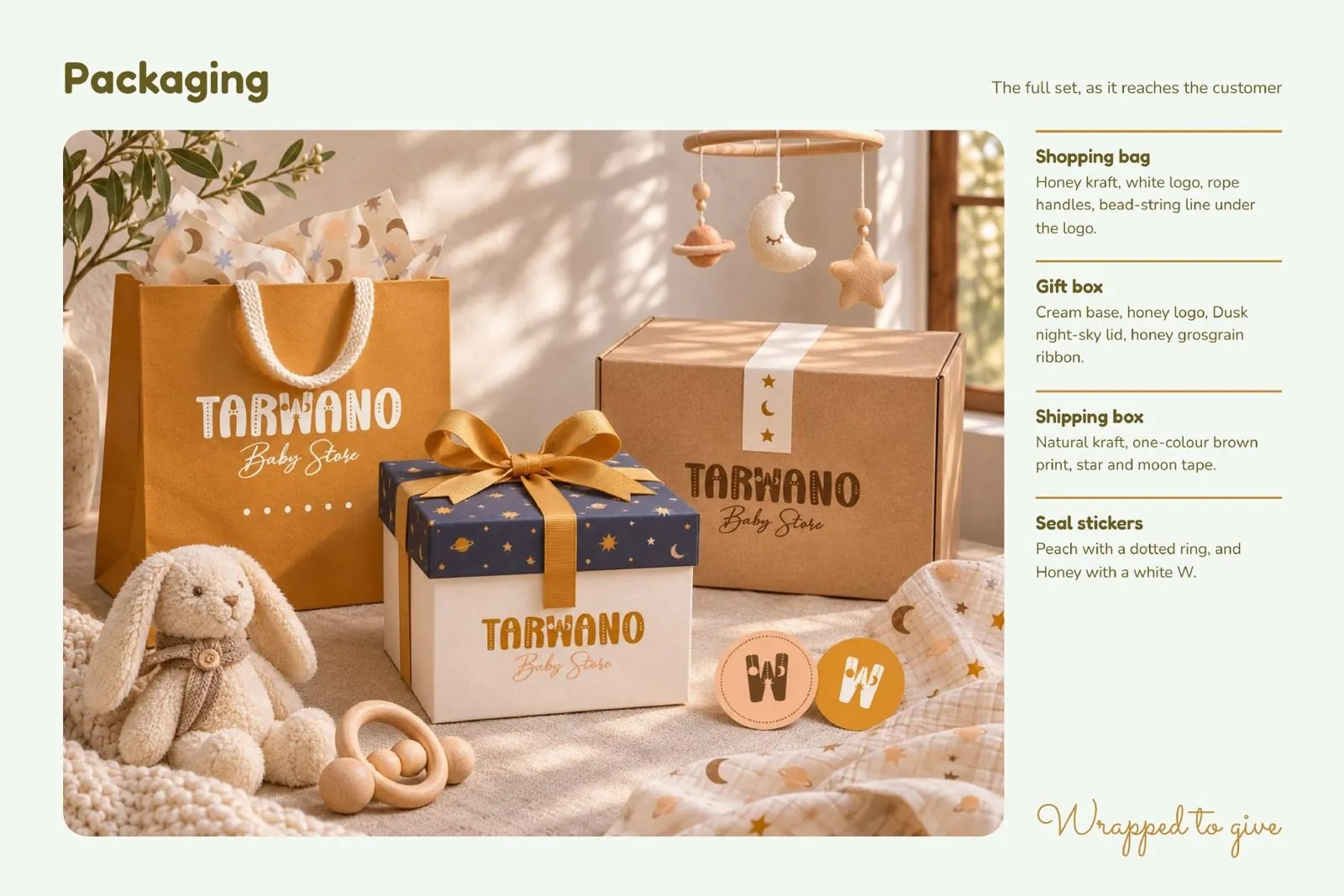
Packaging concept: bag, gift box, shipping box and stickers
Packaging concepts, visualised and not yet produced
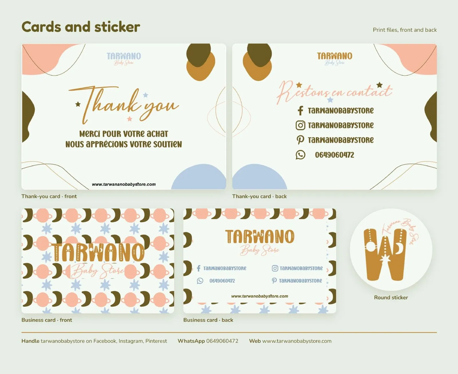
Thank-you cards, business cards and round sticker
Printed assets: cards and sticker
Guidelines · Logo system · Palette · Typography · Patterns · Packaging concepts · Print assets
Start a project

Your brand could be next.

Have a project in mind? Let's talk about what you're trying to achieve.

Pick a time